
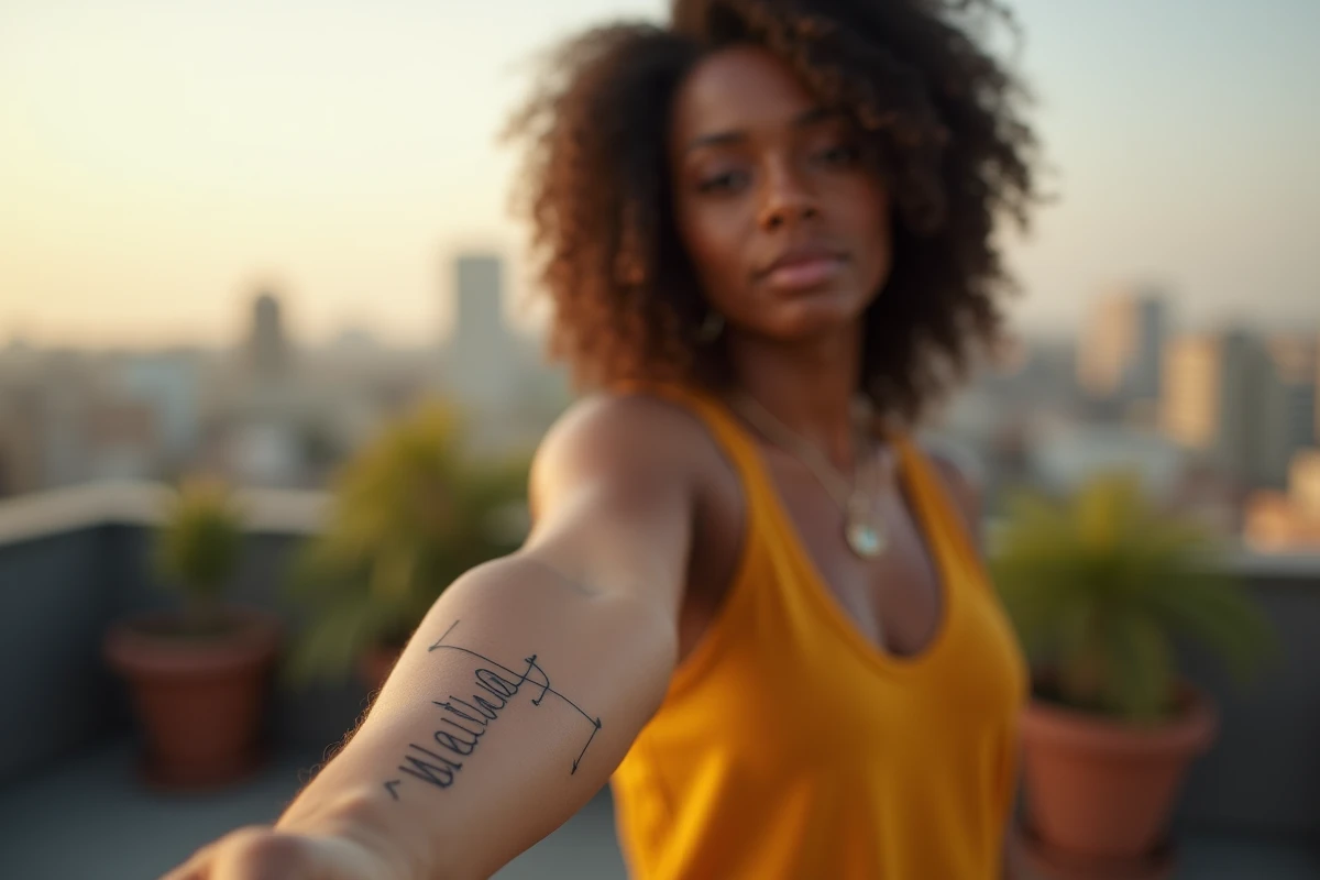
The name tattoo on the forearm remains one of the most requested projects in studios. The area is visible, the lettering unfolds easily, and the result can range from a fine, almost secret line to an elaborate graphic piece. Before choosing a style, a font, or an accompanying motif, one often overlooked step deserves attention: the preliminary digital mockup, which changes the way the project is constructed between the client and the tattoo artist.
Digital mockup before the studio: testing a name tattoo on your own arm
Several applications today allow you to generate a name lettering and project it onto a photo of your forearm. The app Creation Tatouage AI – InkUp, available on the App Store, offers to transform a word into a realistic script rendering with customization of the font and placement. On Google Play, Name Tattoo Maker operates on the same principle with a wide choice of fonts.
Related reading : Ladybug in the house: spiritual meaning and hidden messages to discover
The interest of these tools goes beyond mere amusement. A mockup shown to the tattoo artist serves as a concrete working basis, much more precise than an oral description or a Pinterest capture. The tattoo artist then adapts the design to the morphology of the arm, the thickness of the skin, and their own technique. This intermediate step (digital mockup followed by adaptation in the studio) reduces back-and-forth on the stencil on the day of the session.
Among the name tattoo ideas on Beauté Nature, several renderings illustrate this transition from digital sketch to inked result, providing a realistic idea of the gap between screen and skin.
See also : Fashion trends and tips: inspirations to elevate your style every day

Choosing the font for a name tattoo that remains readable over time
The font alone determines the visual longevity of the tattoo. A script that is too fine, trendy on Instagram, risks becoming illegible after a few years: the lines merge, the serifs disappear, and the name loses clarity. Canva publishes guides dedicated to choosing fonts for tattoos and specifically points out this trap.
Medium serif fonts and thick cursives age better than ultra-fine scripts. On the forearm, the skin moves less than on the wrist or the inside of the elbow, which offers an advantage. However, the inner forearm, being thinner, requires a slightly bolder line than the outer side.
Font families suitable for the forearm
- Classic cursives (like English or copperplate) offer an elegant rendering but require a tattoo artist skilled in thick and thin lines to avoid smudging over time.
- Sans-serif fonts (like block or simplified gothic) ensure clear reading even at small sizes, ideal for a short name on the lateral side of the arm.
- Custom handwritten typography, reproduced from the actual writing of a loved one, brings an emotional dimension that standard fonts cannot offer.
The choice is not made solely on the aesthetics of the day. A good tattoo artist will refuse a font they know is unsuitable for the area, even if the client insists. This honest conversation, before the session, avoids costly touch-ups a few years later.
Name tattoo for men or women: what really changes according to morphology
Idea compilations often separate “men’s” and “women’s” name tattoos as two distinct universes. The reality in the studio is more nuanced. What determines the final rendering is the width of the forearm, hairiness, skin tone, and skin texture, not gender.
A wide forearm allows for stretched lettering, sometimes accompanied by complementary motifs (birth date, small symbol, extension line). A narrower forearm necessitates vertical or arched lettering, or else the letters risk compressing at the ends. The size of the name must be calibrated to the available width, not to an aesthetic standard.
Dense hairiness darkens the overall rendering. An experienced tattoo artist takes this into account when choosing ink and line thickness. On very light skin, fine inks stand out more, while darker skin tones may require a bolder line to maintain readability over the long term.
Accompanying motifs on the forearm: when the name alone is not enough
A name alone, centered on the forearm, works perfectly in a minimalist version. However, many projects evolve into a broader composition, where the name integrates into a graphic whole.
Common associations and their constraints
- A name framed by floral elements (roses, birth flowers) gives a visually rich result but requires enough space for each element to remain legible. On a narrow forearm, the rendering can quickly appear cluttered.
- Geometric lines or a fine line extending the lettering offer a contemporary touch without overloading the area. This type of composition ages well because the shapes remain simple.
- Adding a date (birth, meeting) in Roman or Arabic numerals complements the name with additional information, provided a clear hierarchy is maintained between the main text and the secondary element.
The accompanying motif must never compete with the readability of the name. If the eye hesitates between the lettering and the decoration, the tattoo artist should simplify the composition or increase the size of the text.

The name tattoo on the forearm remains a project where preparation counts as much as the tattoo artist’s gesture. Testing several fonts on a digital mockup, discussing morphological constraints in advance, and resisting the temptation to overload the motif are the three points that separate a satisfying result from a tattoo one might consider covering up a few years later.